What is TailwindCSS ?
Tailwind CSS is a highly customizable, low-level CSS framework that allows you to custom-build designs eliminating opinionated component styles that you would anyway want to override.
Why TailwindCSS ?
There’s a lot that goes on in web development. It can sometimes, thus, become an overly complicated task. Mapping the impact of styling might become tedious and time-consuming hampering the progress of the application/website.
Implementing Tailwind CSS will eliminate all the above-mentioned issues. Tailwind CSS creates small utilities with a defined set of options enabling easy integration of existing classes directly into the HTML code. Custom styling can be provided to the components with the help of this framework.
Installation
Let's start our project with installing TailwindCSS and it's dependencies
# If you're using npm
npm install -D tailwindcss@latest postcss@latest autoprefixer@latest

# If your're using yarn
yarn add -D tailwindcss@latest postcss@latest autoprefixer@latest
Next we will generate tailwind.config.js file and postcss.config.js files which can be used to customize Tailwind even further, you can easily create this file by running
npx tailwindcss init -p
This will create a minimal tailwind.config.js file at the root of your project.
module.exports = {
  purge: [],
  darkMode: false,
  theme: {
    extend: {},
  },
  variants: {
    extend: {},
  },
  plugins: [],
}
It will also create a postcss.config.js file that includes tailwindcss and autoprefixer already configured we won't be using any other plugins for this project so we will leave this file as is.
Purging unused CSS
TailwindCSS comes with built-in support to purge the unused CSS and only use one's that we use in our project thus reducing our bundle size.
In our tailwind.config.js file add the locations of our files so Purge CSS can include these files too .
  module.exports = {
   purge: [
     './pages/**/*.{js,ts,jsx,tsx}',
     './components/**/*.{js,ts,jsx,tsx}',
     './layouts/**/*.{js,ts,jsx,tsx}'
   ],
    darkMode: false,
    theme: {
      extend: {},
    },
    variants: {
      extend: {},
    },
    plugins: [],
  }
All files within these directorie's with the extensions .js,.ts,.jsx,.tsx will be picked up by Purge CSS.
Adding Tailwind to globals.css
Open the ./styles/globals.css file that NextJS generates for you by default and add these to it.
@tailwind base;
@tailwind components;
@tailwind utilities;
this will import tailwinds base, components and utilites for use to use on our project, and make sure you correctly import your globals.css file in your _app.js file.
import '../styles/globals.css';

function MyApp({ Component, pageProps }) {
  return <Component {...pageProps} />;
}

export default MyApp;
Dark Mode support
Let's also try to add Dark Mode support to our NextJS application which is a good addition to have in our application since most people prefer to use Dark mode over Light mode.
To quickly switch between Dark Mode and Light Mode we will be using next-themes so let's install it quickly.
# If you use npm
npm install next-themes

# If you use yarn
yarn add next-themes
Now in our tailwind.config.js file let's replace darkMode value with class instead of false. We will be using Tailwinds dark variant that let's you style differently when dark mode is enabled.
  module.exports = {
   purge: [
     './pages/**/*.{js,ts,jsx,tsx}',
     './components/**/*.{js,ts,jsx,tsx}',
     './layouts/**/*.{js,ts,jsx,tsx}'
   ],
    darkMode: 'class',
  }
Now in our _app.js file wrap the component within next-themes ThemeProvider with attribute as class.
import '../styles/globals.css';

import { ThemeProvider } from 'next-themes';

function MyApp({ Component, pageProps }) {
  return (
    <ThemeProvider attribute="class">
      <Component {...pageProps} />
    </ThemeProvider>
  );
}

export default MyApp;
with that done let's create a ThemeToggler component, for that let's open a new file ThemeToggler.jsx and add these to the file.
import { useTheme } from 'next-themes';
import { useEffect, useState } from 'react';

export default function ThemeToggler() {
  const [mounted, setMounted] = useState(false);
  const { resolvedTheme, setTheme } = useTheme();

  useEffect(() => setMounted(true), []);

  return (
    <button
      aria-label="Toggle Dark Mode"
      type="button"
      className="w-10 h-10 p-3 bg-gray-200 rounded dark:bg-dark-muted"
      onClick={() => setTheme(resolvedTheme === 'dark' ? 'light' : 'dark')}
    >
      {mounted && (
        <svg
          xmlns="http://www.w3.org/2000/svg"
          viewBox="0 0 24 24"
          fill="currentColor"
          stroke="currentColor"
          className="w-4 h-4 text-gray-800 dark:text-gray-200"
        >
          {resolvedTheme === 'dark' ? (
            <path
              strokeLinecap="round"
              strokeLinejoin="round"
              strokeWidth={2}
              d="M12 3v1m0 16v1m9-9h-1M4 12H3m15.364 6.364l-.707-.707M6.343 6.343l-.707-.707m12.728 0l-.707.707M6.343 17.657l-.707.707M16 12a4 4 0 11-8 0 4 4 0 018 0z"
            />
          ) : (
            <path
              strokeLinecap="round"
              strokeLinejoin="round"
              strokeWidth={2}
              d="M20.354 15.354A9 9 0 018.646 3.646 9.003 9.003 0 0012 21a9.003 9.003 0 008.354-5.646z"
            />
          )}
        </svg>
      )}
    </button>
  );
}
Finally let's add the appropriate styling for the dark mode to your components, this can be done by adding dark: prefix to your styling with that our components ready let's test it out.

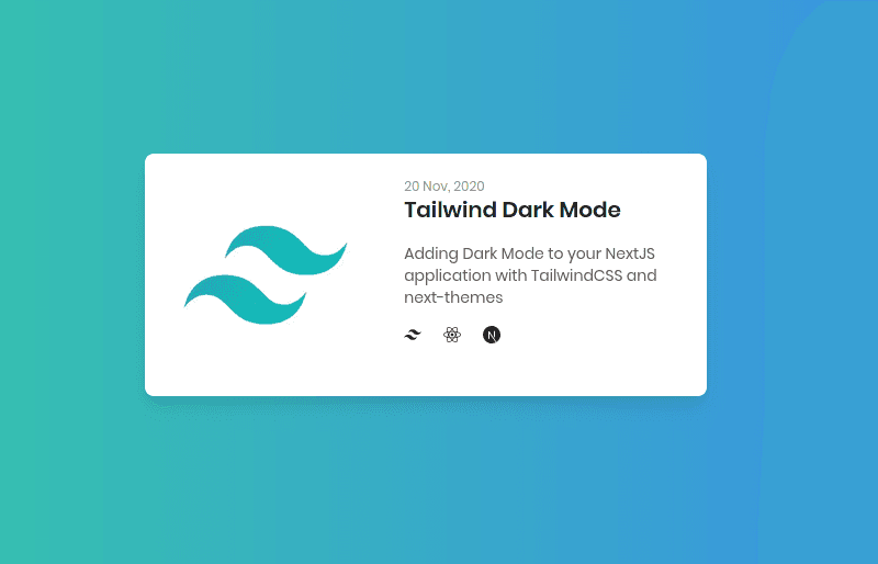
Card with Tailwind Light mode

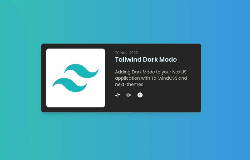
Card with Tailwind Dark mode
And that's it, we just added TailwindCSS to our NextJS application and also added Dark Mode support to it. If you would like to know more about customizing and configuring TailwindCSS you can read more at Tailwind Docs
